
Every season, PANTONE reveals a color palette that will shape fashion, design, and décor around the world. And while it may seem like a simple aesthetic whim, the truth is that these shades tell a deeper story: they reflect how we feel as a society and what we seek in our everyday lives.
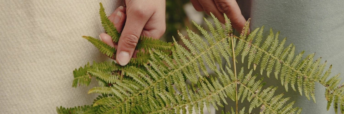
This autumn, the stars are natural, earthy colors. Muted greens, warm browns, soft beiges… shades that convey calm, a connection with nature, and stability in uncertain times. PANTONE doesn't choose at random: it analyzes cultural trends, social changes, and even collective emotional needs. In other words, the colors in fashion are a mirror of what we live through.

The best part is that these autumnal shades pair perfectly with "seasonless" colors: neutrals like white, black, or gray, which never go out of style. This way, you can build a versatile wardrobe that works in autumn, winter, and beyond.

At Greener, we have adopted this palette in our collection, but with a different approach: we use the colors of the season in timeless designs, created to last more than one season. Because we believe that true style never expires, and that sustainability begins when we wear garments that continue to make sense over time.
🍂 This autumn, dare to wear the colors that reflect calm and connection, but do it with clothes that also take care of the planet.